
Bringing Artisanal Flavor to Life
Ôtta is a pizzeria that stands out for its authenticity, visual flair, and dedication to craftsmanship — not only in the food it serves but in the full dining experience it creates. The brand needed to communicate passion, playfulness, and flavor from the very first glance.
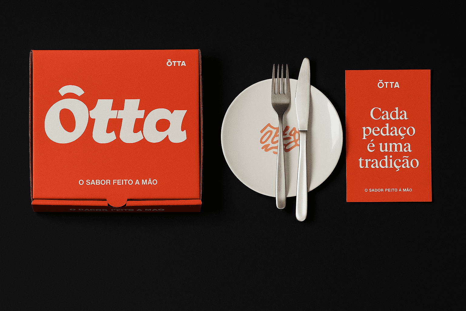
Our design approach began with Ôtta’s identity as a bold yet refined brand — blending tradition and creativity in every detail. The logo features smooth, melting letterforms that evoke hot cheese and hand-crafted sauce, instantly connecting the viewer to warmth, comfort, and indulgence. The typographic choices balance retro warmth with modern simplicity, making the identity feel familiar but fresh.
The color palette was inspired directly by the pizzeria’s core ingredients and environment:
Molho Vulcano, a vibrant red-orange tone, represents the oven’s fire and fresh tomato sauce
Farinha Nobre, a refined neutral beige, echoes the artisanal flour and dough
Forno à Lenha, a rustic, smoky gray, evokes the ambiance of wood-fired baking
We translated these ingredients into visual language across Ôtta’s menus, boxes, uniforms, and merchandise — resulting in a holistic experience that celebrates flavor, quality, and story.
Brand Design Objectives


Ôtta’s brand isn’t just aesthetic — it’s experiential. Every physical touchpoint, from the takeaway box to the menu in-hand, was designed to elicit curiosity and joy. The brand invites customers to feel what Ôtta stands for: real ingredients, honest flavor, and a little bit of fun.
OUTCOME
Since its launch, Ôtta has built an instantly recognizable identity — drawing attention on social media and in the streets. The bold logo and packaging design have helped the pizzeria establish itself as a destination for food lovers who value taste, culture, and memorable design.
